Toelichting OPERA Amsterdam | Beeld Thijs Wolzak en Mike Bink, forget-me-nots (hoofdfoto)
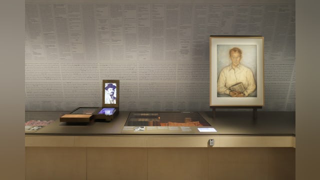
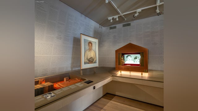
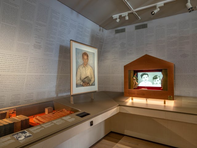
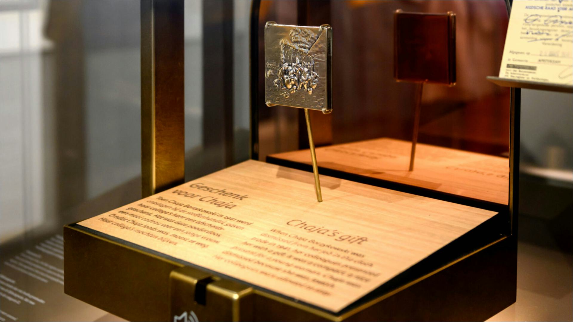
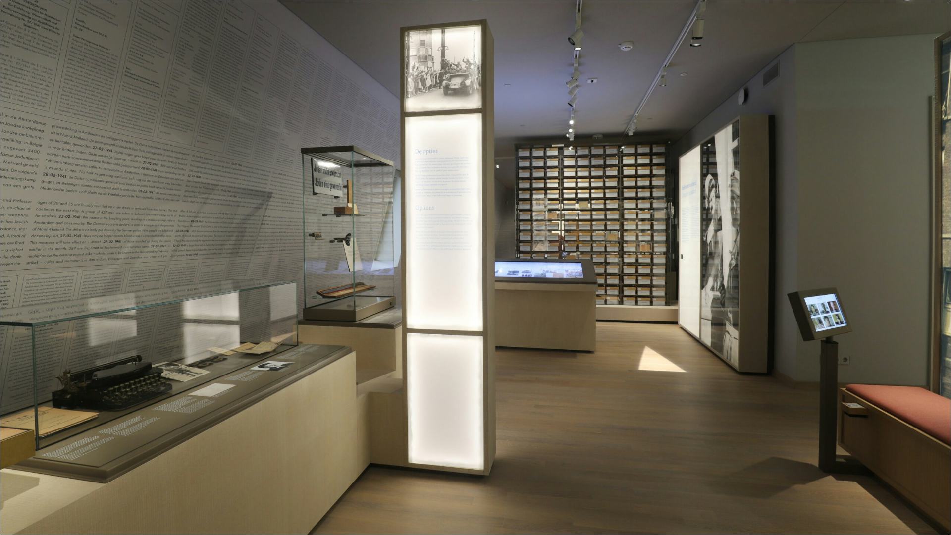
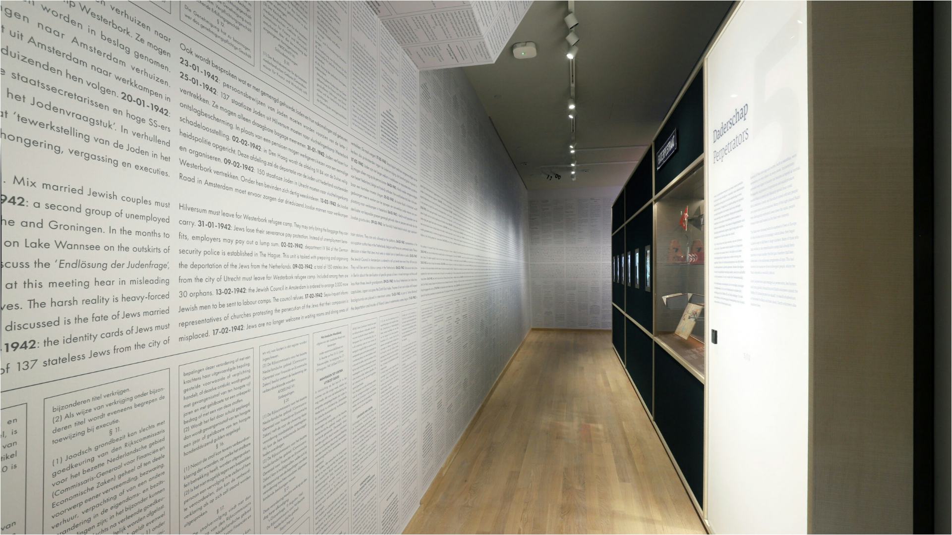
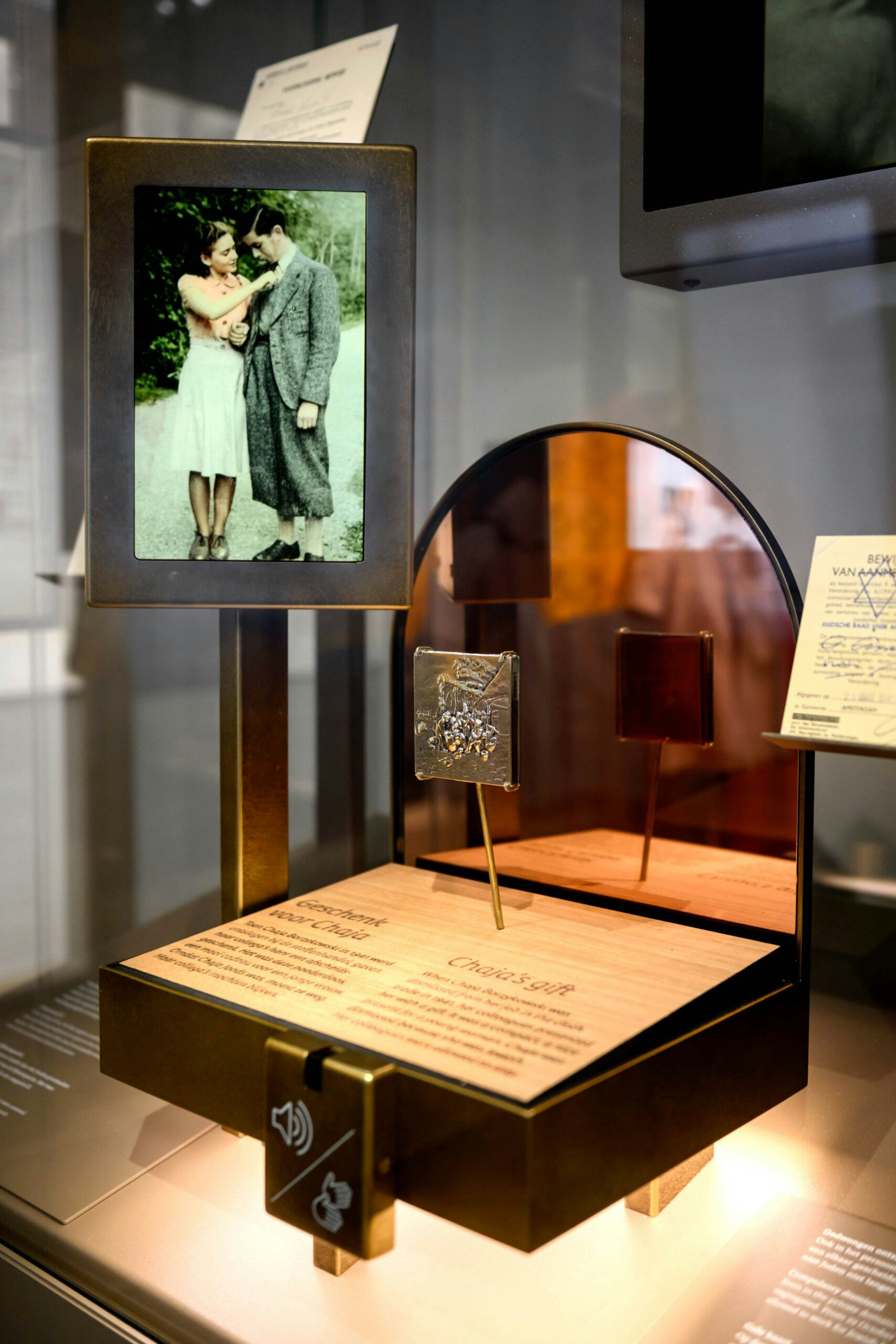
One of the exhibition's foremost goals is to dehumanise the victims. Grand gestures are usually used to show the victims' massiveness. We use them to depict the anti-Jewish measures in meters-long ‘crime wallpaper’. Commonly, art is used to abstract horror. We use it to humanise the victims. Through theatrical installations, we present the 'forget-me-nots,' personal stories that humanise the victims. Each narrative reminds us that every victim was a human being with a life and a story to tell.
The exhibition designers worked closely with Office Winhov to preserve both buildings' architectural integrity and historical significance, which are paramount as carriers of the narrative.
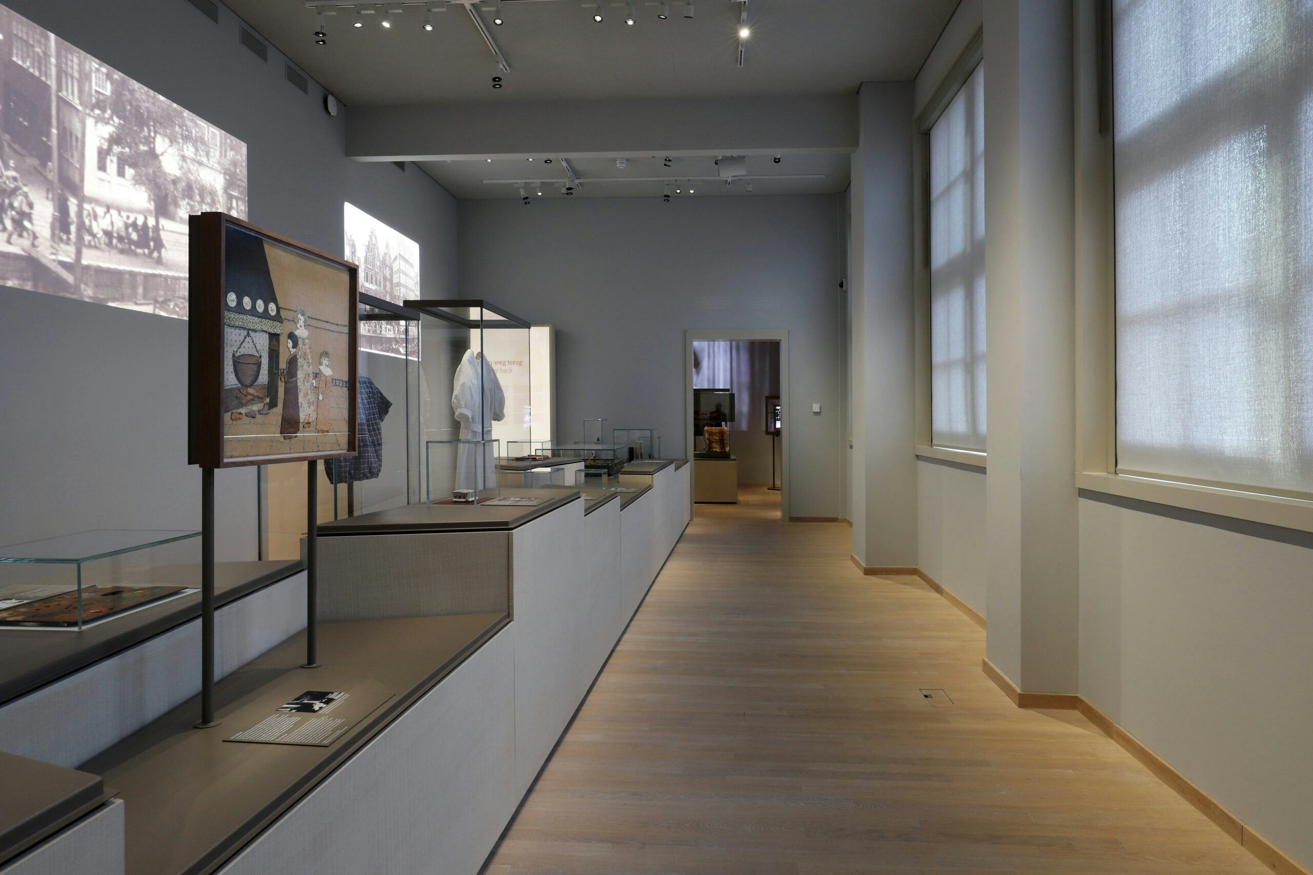
We sought to create a light and transparent museum with the architect where history is brought into daylight. Deviating from the familiar, heavy, and dark-colored designs, we created an environment that could house the complex topics being explored.
The goal was to create a light building. To this end, light texturised wood was used with grey-painted steel for frames and plinth tops, consistent with the building colours. Additional colour was minimal to accentuate the objects better. An exception was made for the ‘forget-me-nots,’ where warmth radiated the victims’ lives. Lightboxes used for text and images enhanced the feeling of lightness. The restrained palette and use of material created a calm environment for the complex topics.
Once the sustainability of the materials being used has been verified, ensuring the longevity and fit-for-purpose use of exhibition elements is critical. The longevity of furniture showcases, and other exhibition elements is essential to working sustainably. Construction methods also play an important role. Enabling the easy replacement of damaged parts guarantees the exhibition will continue to look its best far into the future, requiring only updated content to stay fresh and relevant.
Audience engagement played a role in the development of the exhibition. Different target audiences were consulted to confirm alignment with visitors’ expectations. Addressing various senses was critical to reaching the broadest people. The content was written to ensure the amount and tone didn’t overwhelm visitors. The narrative also reflected different perspectives—blind, disabled, Caribbean, Sinti, and Roma. Physical accessibility ensured visitors could move freely and rest when needed.
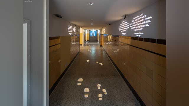
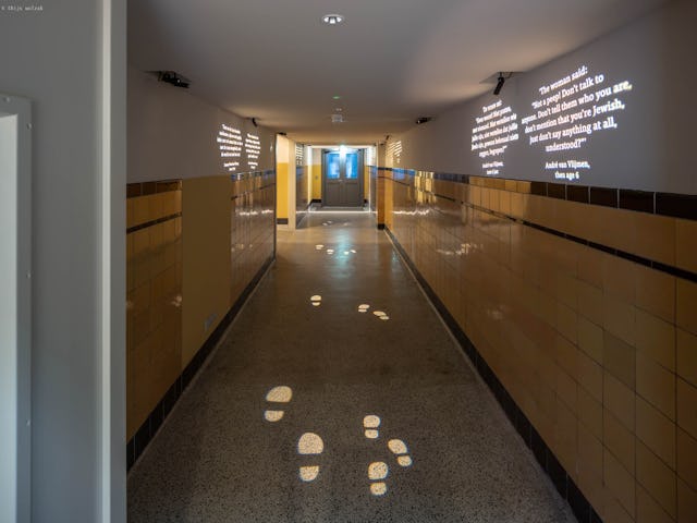
The significance of the location in telling the story is profound. The exhibition is structured on the Gr Fl to tell history where it happened. In the Kweekschool, visitors observe the garden and read accounts of children lifted over the wall from the creche and transported away unseen, thanks to the nearby tram stop. The Shouwburg's role as a deportation centre is brought home by walls adorned with half-glass spheres containing illuminated portraits of Jews who traversed through the Shouwburg.